Lilypad
EdTech Startup: Student Evaluation Service for School Districts

Overview.
I collaborated with a startup to redesign their landing page concept before it was published. With no existing analytics or user feedback to draw from, I focused on creating a clear and compelling layout that highlighted the startup's value proposition and guided visitors toward key action, such as requesting more information.
Challenges
Since this was the first version of the landing page, all design decisions were based on best practices and internal stakeholder feedback.
The startup needed a concise way to explain what they do and why it matters.
The design had to be flexible enough to evolve as the startup's product offerings expand.
Typography.
Typeface
Plus Jakarta Sans
Weights
Regular
Semi-Bold
Bold
Colors.
Design Approach.
Content
Collaborated with the startup team to define and highlight their core benefits, ensuring every section of the page directly addressed key user questions and pain points.
Visual Hierarchy & Layout
Created a clean, minimalist design that draws attention to the most important information first. I also used consistent typography and spacing so users can quickly scan and understand the page's content.
Calls-to-Action
Strategically placed CTAs in prominent locations, making it easy for users to take the next step.
Responsive Design
Optimized the layout for mobile and tablet devices since the startup anticipates a significant portion of traffic coming from mobile users. and ensured images and text scaled appropriately to maintain readability across various screen sizes.
Mobile-First Design.


Responsive Design.

Design System from Programmer's Perspective.
Consistent Layout Primitives
The layout system was built on a strict, responsive grid, not just for visual balance, but to make development predictable and scalable. Each breakpoint uses a defined column count, gutter width, and max container size (as shown). Instead of custom padding on every section, I used consistent primitives like max-w-7xl, px-8, and my-16.

Built for Responsive & Future Growth
I designed every section with clear breakpoints in mind, mobile, tablet, desktop, so devs could rely on consistent stacking behavior and spacing logic. The system also leaves room to scale as new content types or layouts are added.

Next Steps.
Once the page goes live, we plan to track engagement metrics (e.g., click-through rates, sign-ups) and collect user feedback to evaluate the effectiveness of the design.
Based on early insights, we will refine the messaging, visuals, and CTA placement to optimize the user journey.
After launch, moderated or unmoderated user testing could provide valuable qualitative feedback to guide future iterations.
Explore Figma File.
Design speaks louder than words. Check out the full Figma file to see the process, decisions, and iterations behind this project.
Check Out Figma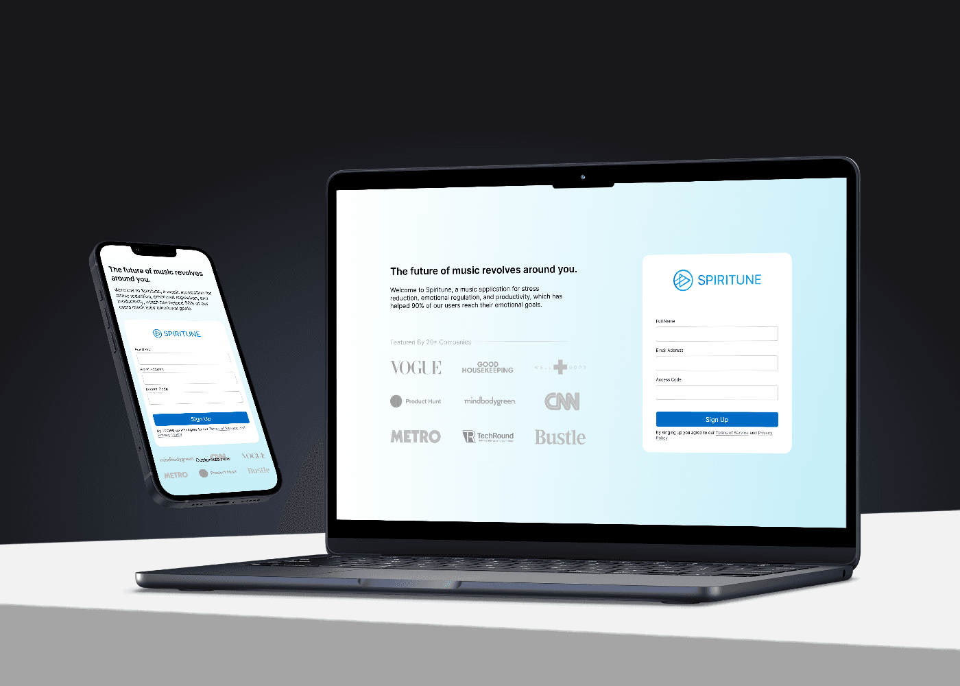


Let's make something users will love!
If you're looking for a product designer who can bridge the gap between design and code, I'm here to help!