This guide shows you how to build and implement design tokens using Figma Variables, then translate them into code with Next.js, TypeScript, and Tailwind CSS.
What Are Design Tokens?
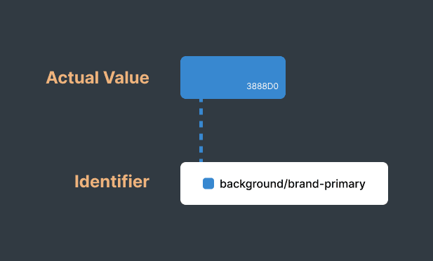
Tokens are essentially labels for design choices. Instead of scattering actual values throughout your codebase, you create a shared vocabulary. Designers and developers both point to the same name.
The Two-Part Structure
- An identifier - something readable like
brand-primary - An actual value - which could be a color hex, pixel measurement, font family, or even reference another token
Why Design Tokens Matter
Consistency at Scale
The same design values are used across all platforms, products, and teams. No more visual inconsistencies or "close enough" colors.
Faster Development
Developers use pre-defined values instead of making design decisions in code. Components ship faster with fewer design review cycles.
Effortless Updates
Rebrand your entire product by updating a handful of token values. What used to take weeks now takes minutes.
Multi-Platform Support
Define once, use everywhere. Your tokens work on web, iOS, Android, and any future platform.
Theming Built-In
Switch between light mode, dark mode, or brand variations by swapping token values, no component changes needed.
When to Use Design Tokens
Design tokens are most valuable when:
- You're building products across multiple platforms (web, iOS, Android)
- Your product needs theming (dark mode, brand variations, white-labeling)
- Multiple teams work on the same product
- You plan to scale or evolve your design system
- Design-to-development handoff takes too long
- You're experiencing visual inconsistencies across your product
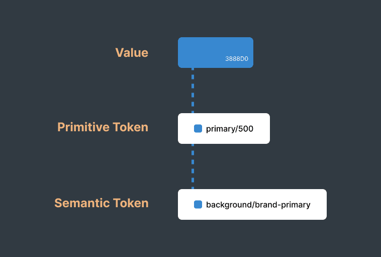
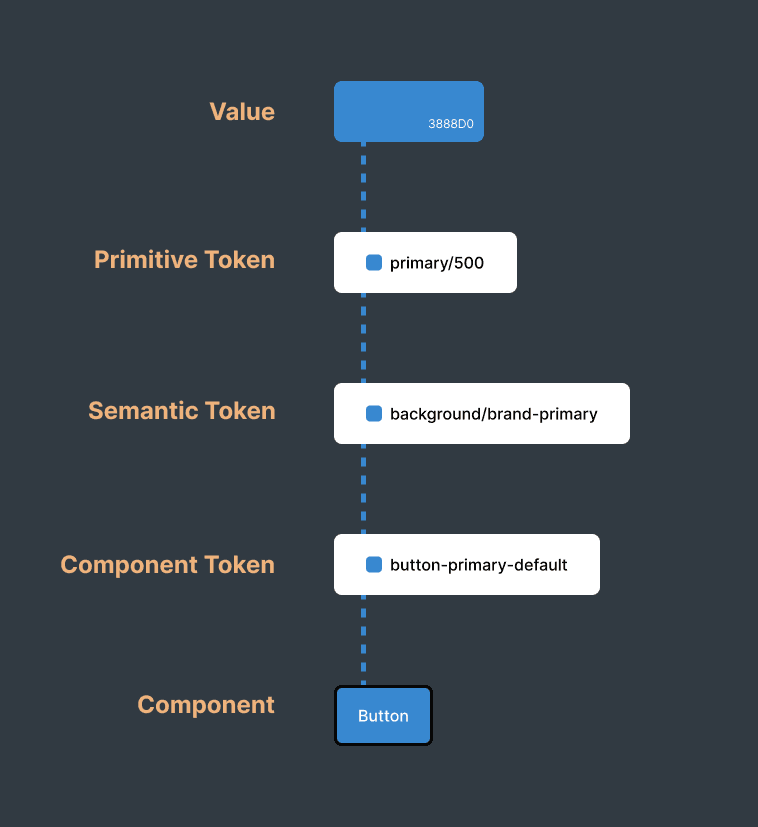
Understanding Token Hierarchy
Professional design systems organize tokens in three tiers. This structure enables flexibility, theming, and clear communication between designers and developers.
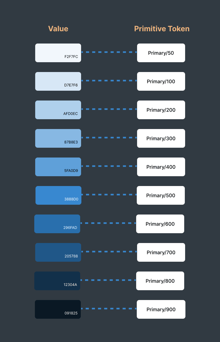
Tier 1: Primitive Tokens
Raw values with no context, create your palette of options.
Tier 2: Semantic Tokens
Meaningful names that reference primitives, conveying purpose.
Tier 3: Component Tokens
Component-specific tokens that reference semantic tokens.
Token Categories
Design tokens organize your visual language into structured categories. Here are the essential token types for modern design systems:
Color Tokens
Brand colors, neutral scales, semantic colors, and UI palettes
- Brand colors (buttons, links, key actions)
- Neutral grays (text, backgrounds, borders)
- Semantic colors (success, error, warning)
Typography Tokens
Font families, sizes, weights, and line heights
- Font families (sans, serif, mono)
- Font sizes (xs through 9xl)
- Font weights (400, 500, 600, 700)
Spacing Tokens
Padding, margins, gaps, and layout spacing values
- Padding and margins (components)
- Gaps (flex, grid layouts)
- Width and height (elements)
Border Radius Tokens
Corner rounding from sharp edges to perfect circles
- Small (2-4px): buttons, inputs
- Medium (6-8px): cards, dropdowns
- Full: pills, avatars
Shadow Tokens
Elevation and depth for visual hierarchy
- Small: cards above surface
- Medium: dropdowns, tooltips
- Large: modals, overlays
Motion Tokens
Animation timing, easing, and duration values
- Duration (fast, normal, slow)
- Easing (ease-in, ease-out)
- Delays (transitions, animations)
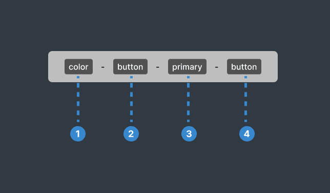
Naming Convention
- Category
The token type (color, spacing, typography, etc.) - Property
What it affects (background, text, border, padding, etc.) - Variant
The specific use case (primary, secondary, error, success, etc.) - State
Optional interaction state (hover, active, disabled, etc.)
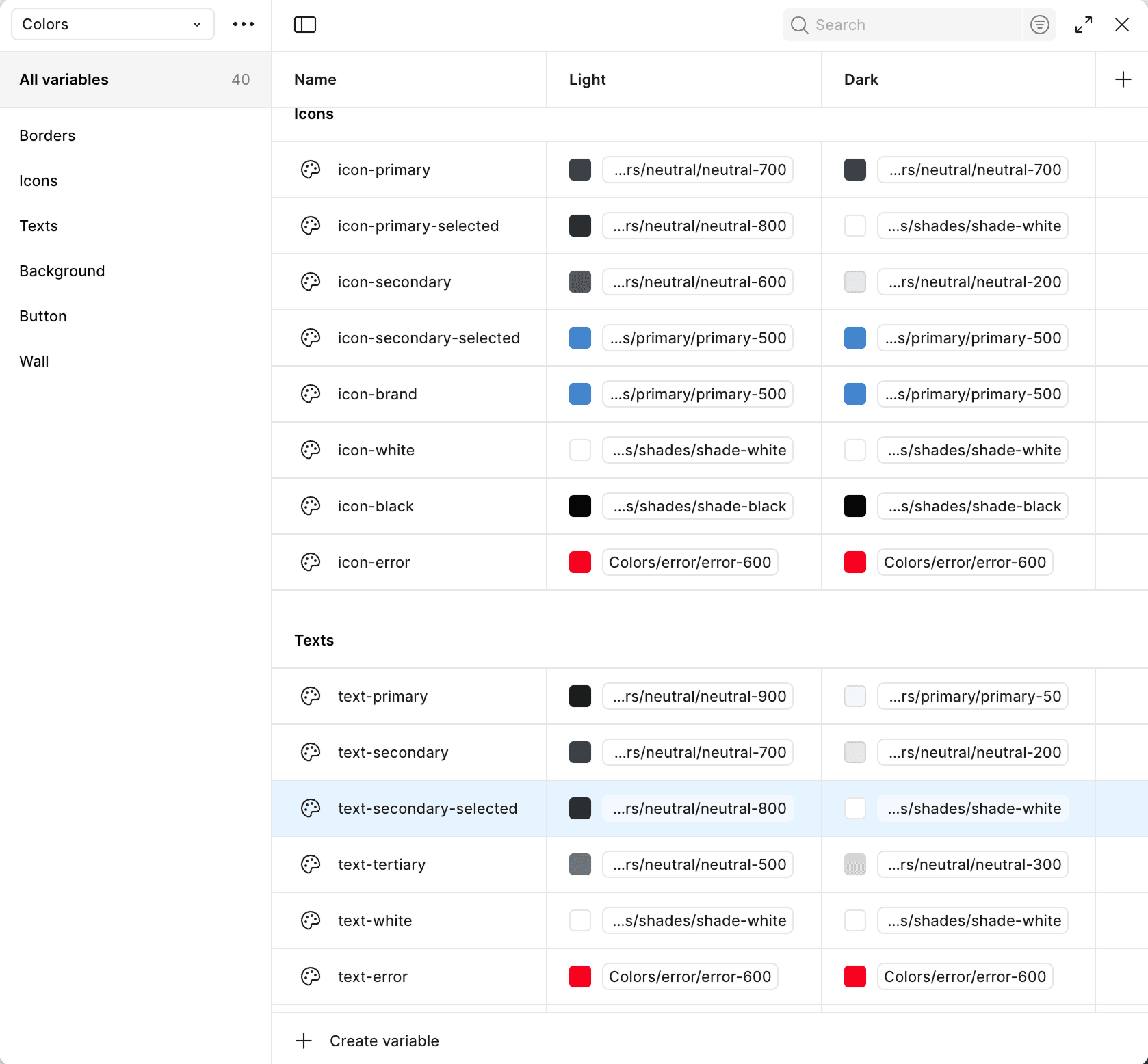
Creating Tokens in Figma
Figma Variables are built for design tokens. Here's how to set up a professional system.
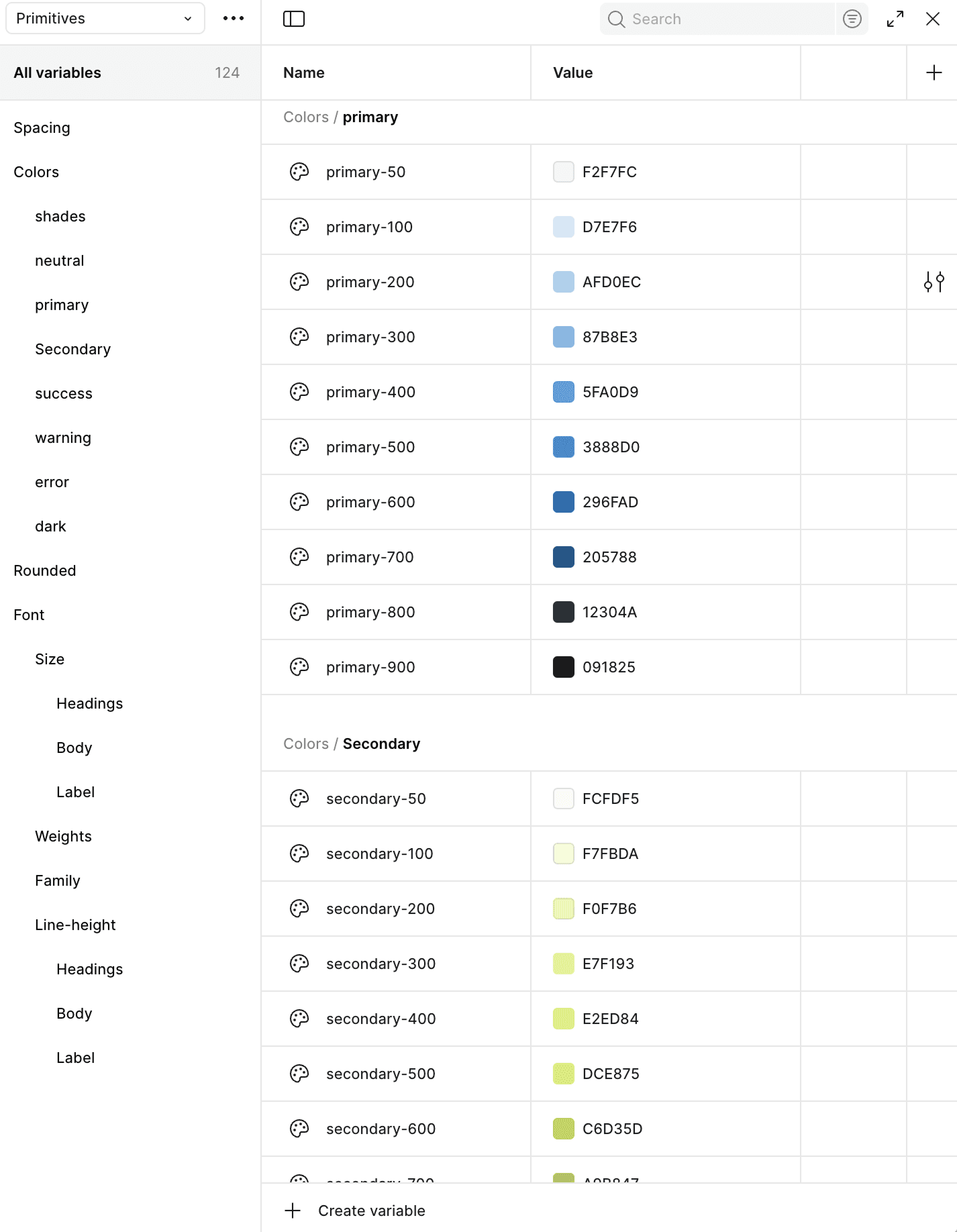
Step 1: Create Primitive Colors
Create Collection: Primitives/Colors
Build your foundational color palette with full shade scales (50, 100, 200...900, 950). For each color family, like primary, warning, or neutral, create variables from primary-50 (lightest) to primary-950 (darkest). These raw values have no semantic meaning yet, they're just your color toolkit waiting to be assigned purpose.
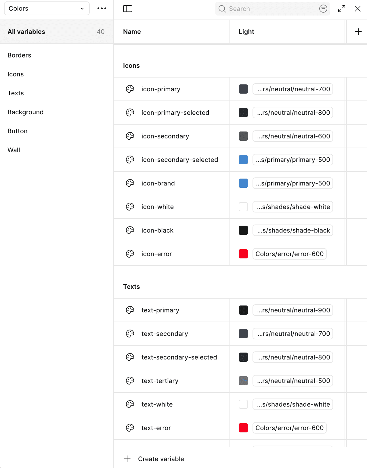
Step 2: Create Semantic Colors
Create Collection: Semantic/Colors
Instead of using raw hex values, assign primitives to semantic tokens based on their purpose. For example, set color-primary to reference primary-600, and color-error to reference warning-600. This creates a meaningful layer between design intent and actual values.
Step 3: Enable Theming
Add new variable mode: Dark
In your Semantic/Colors collection, add a new mode called "Dark". Now each semantic token can reference different primitives per mode. For example, color-primary might reference primary-600 in Light mode but primary-200 in Dark mode for better contrast on dark backgrounds.
Implementing design tokens in code
Now let's translate Figma tokens into your Next.js project with Tailwind CSS. The simplest and most maintainable approach is to define your design tokens directly in your CSS using Tailwind's @theme directive.
Let's implement the three-tier token system in Tailwind CSS. Here's when to use each approach:
- Reference Tokens: Use
@themeto override Tailwind's defaults (e.g.,--color-blue-500) - Semantic Tokens: Use
@layer basewiththeme()function for custom names (e.g.,--color-primary) - Component Tokens: Use
@layer baseto reference semantic/theme tokens (most projects skip this layer)
1. Reference Tokens (Override Tailwind Defaults)
Use the @theme directive to override Tailwind's default color scales, spacing, and typography. This is the official approach from the Tailwind CSS documentation.
These tokens automatically work with Tailwind's utility classes. Use bg-blue-500 for backgrounds, text-gray-900 for text, border-blue-200 for borders. Complete scales (50-950) give you natural progressions for hover states, active states, and visual hierarchy.
/* globals.css */
@import "tailwindcss";

@theme {
  /* Reference Tokens - Your color palette */

  /* Blue scale - Primary brand color */
  --color-blue-50: #eff6ff;
  --color-blue-100: #dbeafe;
  --color-blue-200: #bfdbfe;
  --color-blue-300: #93c5fd;
  --color-blue-400: #60a5fa;
  --color-blue-500: #3b82f6;
  --color-blue-600: #2563eb;
  --color-blue-700: #1d4ed8;
  --color-blue-800: #1e40af;
  --color-blue-900: #1e3a8a;
  --color-blue-950: #172554;

  /* Gray scale - UI colors */
  --color-gray-50: #f9fafb;
  --color-gray-100: #f3f4f6;
  --color-gray-200: #e5e7eb;
  --color-gray-300: #d1d5db;
  --color-gray-400: #9ca3af;
  --color-gray-500: #6b7280;
  --color-gray-600: #4b5563;
  --color-gray-700: #374151;
  --color-gray-800: #1f2937;
  --color-gray-900: #111827;
  --color-gray-950: #030712;
}
2. Semantic Tokens (Custom CSS Properties)
Important: Tailwind's @theme directive only accepts specific token names (like --color-blue-500). For semantic tokens with custom names like --color-primary, use @layer base with CSS custom properties that reference your theme tokens via the theme() function:
These semantic tokens can be used with the var() function in custom CSS or with Tailwind's arbitrary values: bg-[var(--color-primary)]. The theme() function ensures your semantic tokens always reference the correct values from your @theme configuration.
/* globals.css */
@import "tailwindcss";

@theme {
  /* Reference tokens with complete scales (shown above) */
  --color-blue-50: #eff6ff;
  --color-blue-500: #3b82f6;
  --color-blue-600: #2563eb;
  --color-blue-950: #172554;
  /* ... all shades from 50-950 */
}

/* Semantic Tokens - Use CSS custom properties */
@layer base {
  :root {
    /* Semantic color tokens */
    --color-primary: theme(colors.blue.500);
    --color-primary-hover: theme(colors.blue.600);
    --color-primary-light: theme(colors.blue.50);
    --color-primary-dark: theme(colors.blue.900);

    /* Semantic text colors */
    --color-text-primary: theme(colors.gray.900);
    --color-text-secondary: theme(colors.gray.600);
    --color-text-muted: theme(colors.gray.400);

    /* Semantic background colors */
    --color-bg-primary: theme(colors.gray.50);
    --color-bg-secondary: theme(colors.gray.100);
  }

  [data-theme="dark"] {
    /* Override semantic tokens for dark mode */
    --color-primary: theme(colors.blue.400);
    --color-text-primary: theme(colors.gray.50);
    --color-bg-primary: theme(colors.gray.900);
  }
}
3. Component Tokens
Component tokens follow the same pattern as semantic tokens, use @layer base with the theme() function to reference your base or semantic tokens:
Tailwind v4 automatically converts these CSS custom properties into utility classes: bg-button-bg-primary, px-button-padding-x. The --button-bg-primary custom property becomes bg-button-bg-primary class. Notice how component tokens can reference semantic tokens (var(--color-primary)) or theme values directly (theme(colors.white)).
/* globals.css */
@import "tailwindcss";

@theme {
  /* Reference tokens */
  --color-blue-500: #3b82f6;
  --color-blue-600: #2563eb;
  /* ... */
}

/* Semantic Tokens */
@layer base {
  :root {
    --color-primary: theme(colors.blue.500);
    --color-primary-hover: theme(colors.blue.600);
  }
}

/* Component Tokens */
@layer base {
  :root {
    /* Button component tokens */
    --button-bg-primary: var(--color-primary);
    --button-bg-primary-hover: var(--color-primary-hover);
    --button-text-primary: theme(colors.white);
    --button-padding-x: theme(spacing.6);
    --button-padding-y: theme(spacing.2);
    --button-radius: theme(borderRadius.md);

    /* Card component tokens */
    --card-background: theme(colors.white);
    --card-padding: theme(spacing.6);
    --card-shadow: theme(boxShadow.lg);
  }
}
Building Components with Tokens
Here's a button component using design tokens with shadcn/ui patterns:
'use client'

import * as React from 'react'
import { Slot } from '@radix-ui/react-slot'
import { cva, type VariantProps } from 'class-variance-authority'

import { cn } from '@/lib/utils'

const buttonVariants = cva(
  'inline-flex items-center justify-center gap-2 text-sm font-medium transition-colors disabled:pointer-events-none disabled:opacity-50',
  {
    variants: {
      variant: {
        default: 'bg-button-bg-primary text-button-text-primary hover:bg-button-bg-primary-hover rounded-button-radius px-button-padding-x py-button-padding-y',
        secondary: 'bg-secondary text-secondary-foreground hover:bg-secondary/80 rounded-md',
        outline: 'border-2 border-input bg-background hover:bg-accent hover:text-accent-foreground rounded-md',
        ghost: 'hover:bg-accent hover:text-accent-foreground rounded-md',
      },
      size: {
        default: 'h-10 px-4 py-2',
        sm: 'h-9 px-3 text-xs',
        lg: 'h-11 px-8',
        icon: 'h-10 w-10',
      },
    },
    defaultVariants: {
      variant: 'default',
      size: 'default',
    },
  }
)

export interface ButtonProps
  extends React.ButtonHTMLAttributes<HTMLButtonElement>,
    VariantProps<typeof buttonVariants> {
  asChild?: boolean
}

const Button = React.forwardRef<HTMLButtonElement, ButtonProps>(
  ({ className, variant, size, asChild = false, ...props }, ref) => {
    const Comp = asChild ? Slot : 'button'
    return (
      <Comp
        className={cn(buttonVariants({ variant, size, className }))}
        ref={ref}
        {...props}
      />
    )
  }
)
Button.displayName = 'Button'

export { Button, buttonVariants }
Component Preview
Here's how the button looks using these component tokens:
Preview of the Button
How tokens cascade:
bg-button-bg-primaryComponent token in the code
--color-primarySemantic token with meaning
#3b82f6Reference token with actual value
Have Questions?
Building design systems can be complex. If you have questions about implementing design tokens in your project or need help getting started, let me know!
Get in Touch